In Dubai Hills Estate, where family life unfolds between landscaped streets and generously planned townhouses, a two level, 232 square metre residence by KSM Interiors quietly resists the polished neutrality that often defines suburban interiors. Home to a family of four, two journalists and contemporary art collectors originally from Russia, the townhouse was never meant to become a perfectly composed design statement. Instead, it was envisioned as something more elusive: a home that feels genuinely lived in.

“The clients wanted to turn the house into a true home that reflects their interests and lifestyle,” explains designer Karina Seiful-Mulyukova, founder of KSM Interiors, who worked alongside architect Alexandra Ladanova. “A colourful interior, space for their art collection, and a comfortable environment for all family members became the key priorities.”
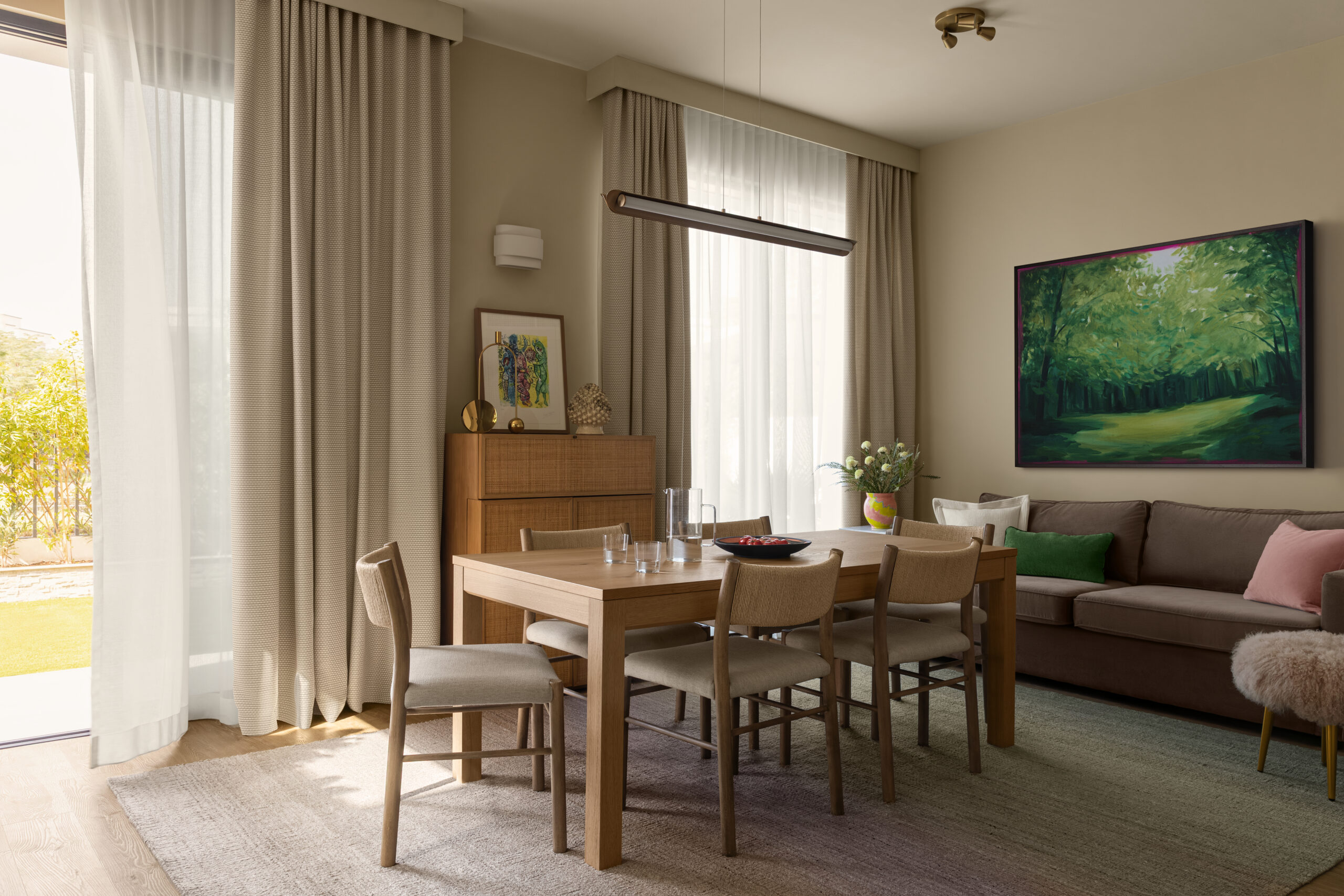
Delivered by the developer as a white box and initially furnished by the owners, the house underwent no radical architectural transformation. Yet one precise intervention altered its atmosphere entirely. An additional window was introduced into the living area after a month long approval process, allowing natural light to penetrate deeper into the ground floor and reframing the relationship between interior and garden. Today, the kitchen and bar area overlook greenery, softening the threshold between indoors and out.


The project’s visual language emerged from an unexpected source: the homeowners’ art collection, a mix of Russian masters from the 1970s and younger contemporary voices united by what Seiful-Mulyukova describes as “a gentle and colourful palette.” The owner articulated the brief with unusual clarity: “My home should feel warm and happy, filled with light and design pieces, but not overly styled or overthought.”

That sentiment quietly shapes the interiors. The palette borrows as much from art as from the client’s wardrobe, where shades of pink, baby blue and grass green recur instinctively. Upstairs, burgundy walls paired with touches of pale blue define the master bedroom and bathroom, where artworks by Yuri Zlotnikov and Andrey Karpov stand against deep maroon surfaces with almost gallery like precision. The teenagers’ rooms move into softer territory, layering pinks and moss greens while preserving individuality.


Downstairs, these colours return more subtly. A sand toned living room becomes a calm backdrop for Meadow, a large scale work by Daria Barybina from Sistema Gallery, positioned deliberately to echo the lush greenery visible through the opposite window. Even the powder room carries humour, animated by playful paper roll graphics by Zina Yusupova.
Materiality introduces another layer of tactility. Glossy marble surfaces and kitchen tiles create what the designer describes as an almost candy like finish, balanced by matte walls and flooring. Achieving the kitchen palette, however, proved unexpectedly demanding. “The supplier produced nine colour samples before we approved the final combination,” says Seiful-Mulyukova of the custom pink and green kitchen by LITE Kitchens, now organised around a bar conceived as the social heart of family life.

Furniture moves fluidly between vintage pieces already owned by the family and recognisable European names. Seating and lighting from West Elm, Crate & Barrel, Dantone Home, Kartell, Verpan and &Tradition sit comfortably beside natural wood furniture, while the bases of the &Tradition ceiling lamps were custom painted to mirror the tones of the room. Beds and sofas were reupholstered and textiles produced locally by Katrin Design and Togas, with Roman blinds chosen in the children’s bedrooms to maximise space and wall matched curtains transforming the TV room into what the designer calls “a jewellery box.”


Elsewhere, details quietly reveal the intimacy of the project. Murano glass bathroom sconces by Correct Form arrived from St Petersburg in cabin luggage. A filtered kitchen mixer travelled the same way. Storage was embedded into custom wardrobes and cabinetry, including a living room cupboard lined with a vivid blue interior that functions as both concealment and decorative punctuation. Decorative objects from Moonstores complete the composition, while paints by Little Greene and Cover Project Dubai anchor the house in a soft but confident chromatic language.

After renovation, the family says the house immediately felt strangely familiar, “as though we have lived here for years.” The garden too was reconsidered, each artwork finding its own place. In the end, this is not a house that performs design for design’s sake. It simply feels inhabited, light filled and deeply personal, exactly as intended.