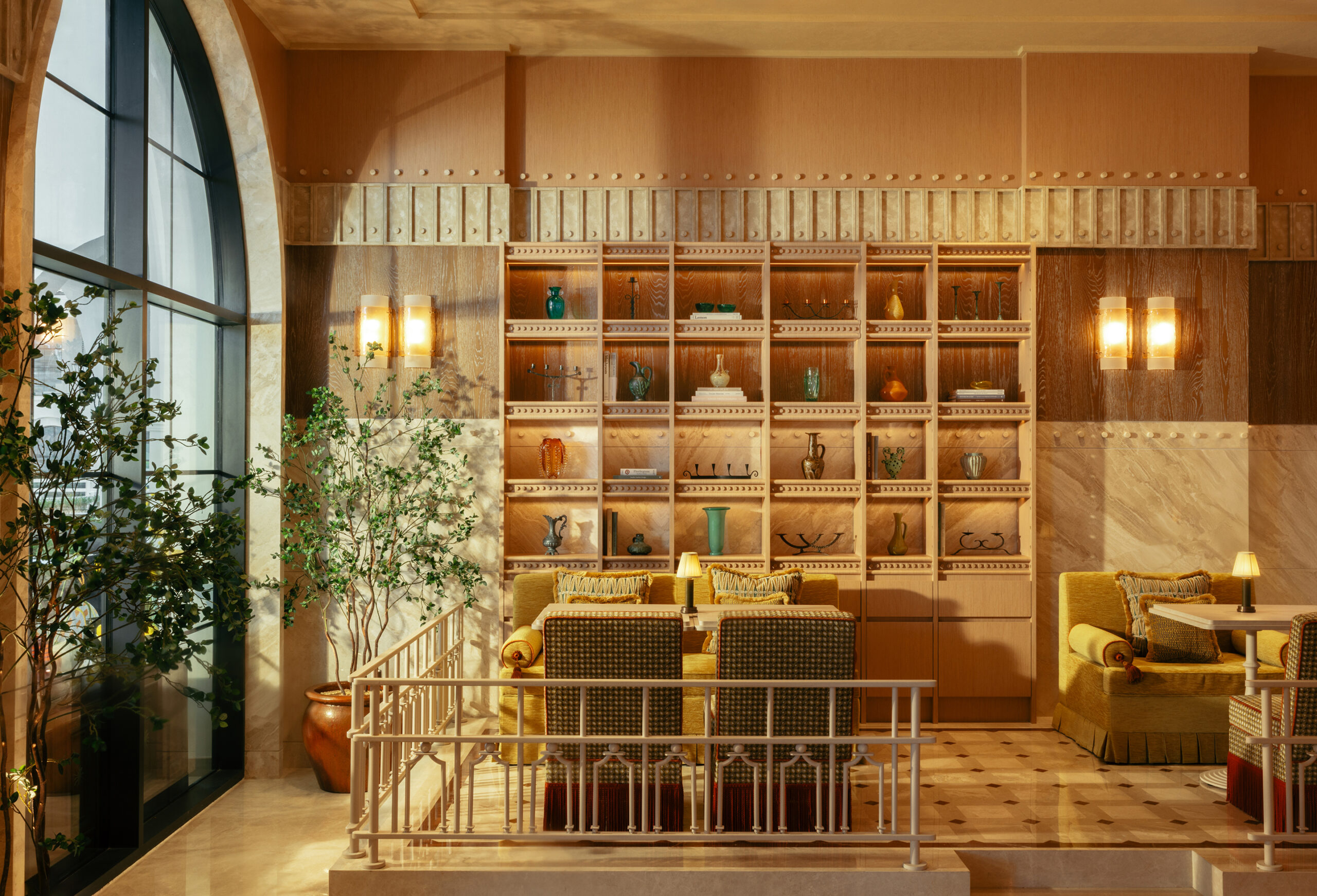
Set within the Abu Dhabi Equestrian Club, overlooking its grounds and horse fields, Solenn begins with an idea that is less about geography than behaviour. Designed by NAQSH Architectural & Engineering Consultancy, the restaurant brings Mediterranean and Arab cultures together without resorting to recognisable motifs or references to a particular destination. Instead, Co-Founder and Creative Director Pariya Manafi looked to something the two cultures fundamentally share: hospitality.
“We approached the cultural dialogue through the values shared by Mediterranean and Arab cultures: hospitality, generosity, warmth and the importance of gathering around food,” Manafi explains. “We wanted these qualities to be experienced rather than simply represented.”
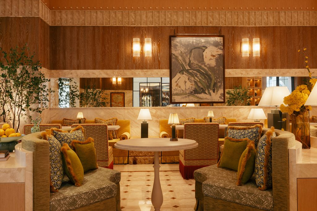
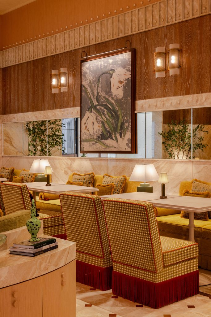
That distinction became fundamental to the project. Rather than constructing an overtly themed Mediterranean interior, NAQSH developed a space with what Manafi describes as a “distinctly residential feel”. Natural materials, tactile fabrics and soft furniture establish an atmosphere closer to a home than a conventional restaurant, while seating was selected not simply for appearance but for comfort.
“Ultimately, our intention was never to create a restaurant where guests simply eat and leave to make way for the next table,” she says. “We wanted Solenn to be a place where people feel comfortable spending hours together, where long lunches turn into extended conversations and the experience of gathering is just as important as the food itself.”
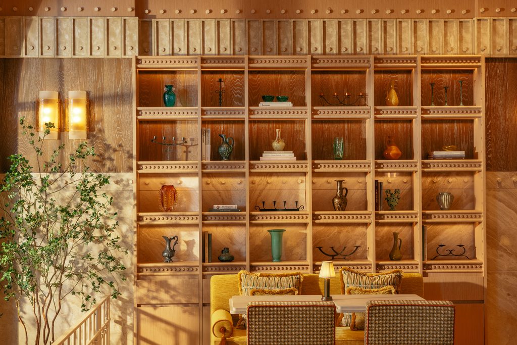
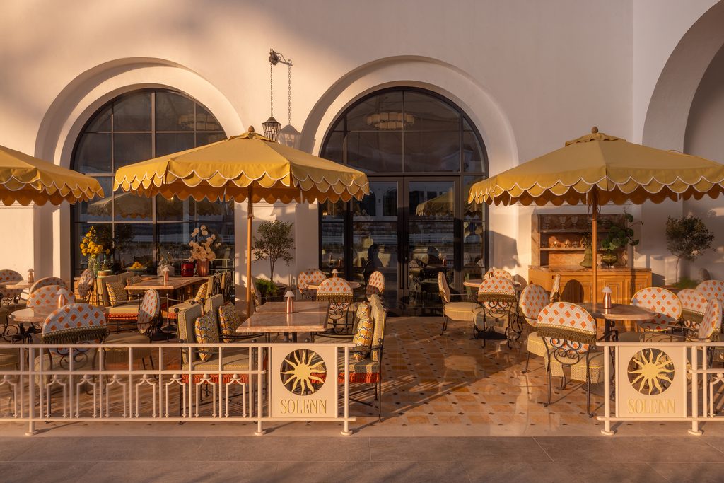
The restaurant’s location reinforces that slower rhythm. Beyond the windows, the equestrian grounds create an unusual sense of openness and calm for an Abu Dhabi dining destination. NAQSH carried that quality inside through warm materials, subdued lighting and generous seating, creating a restaurant capable of shifting almost imperceptibly from daytime dining to more intimate evenings.
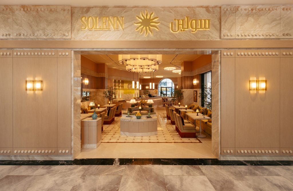
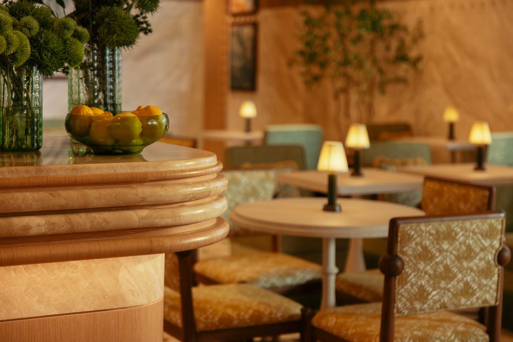
The plan itself is organised around gathering. Seating areas create smaller environments without becoming isolated from one another, while tables can accommodate both groups of four and larger parties. At the centre is the service counter, conceived as the heart of the restaurant and positioned so that no seating area feels peripheral or secondary.
Colour, however, begins somewhere considerably less expected: with a tomato. Manafi wanted the palette to have a direct relationship with Solenn’s culinary identity rather than operate as decoration. The tomato, ubiquitous in Mediterranean cooking, provided a spectrum ranging from deep reds and maroons to warm yellow and fresh green. “The tomato… became an unexpected but natural starting point,” she explains.
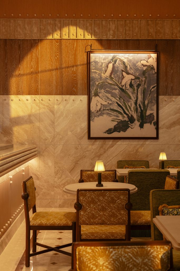
Against a calmer architectural foundation of marble and natural wood, those colours emerge through furniture, upholstery and objects. Larger pieces appear predominantly in yellow and green, while smaller elements introduce deeper maroon tones. “Despite the richness of the palette, the overall atmosphere remains calm and understated,” Manafi says. “This contrast is one of our favourite aspects of the project: demonstrating that a colourful interior can still feel sophisticated, soft and incredibly comfortable.”
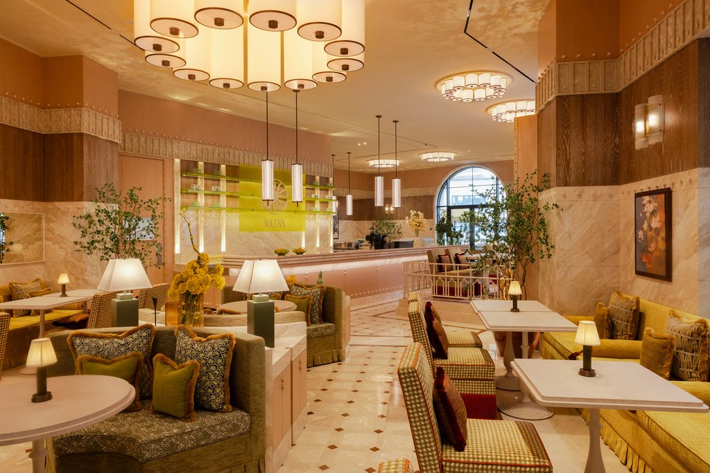
Materiality is deliberately restrained. Marble and natural wood form the architectural base, their variations in grain, veining and texture providing visual depth without requiring additional ornament. The restraint also places greater emphasis on execution.
“Craftsmanship is not necessarily something guests should consciously notice,” says Manafi, “but rather something they experience through the overall quality, harmony and attention to detail of the space.”
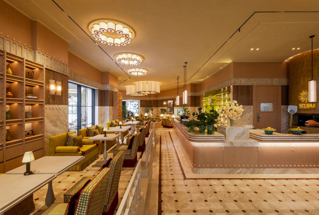
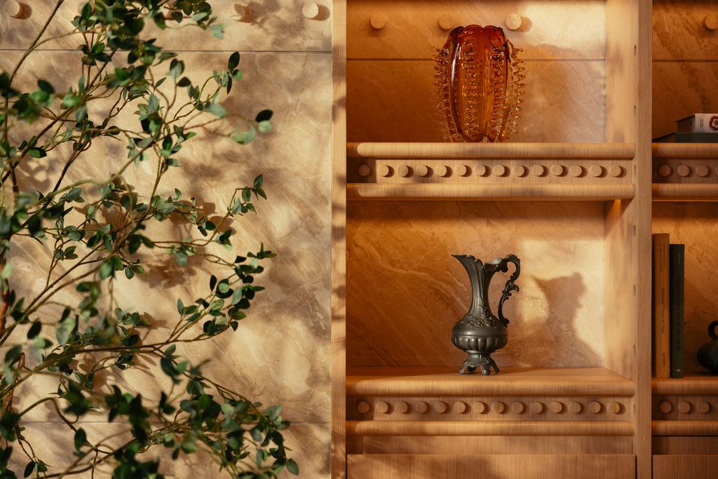
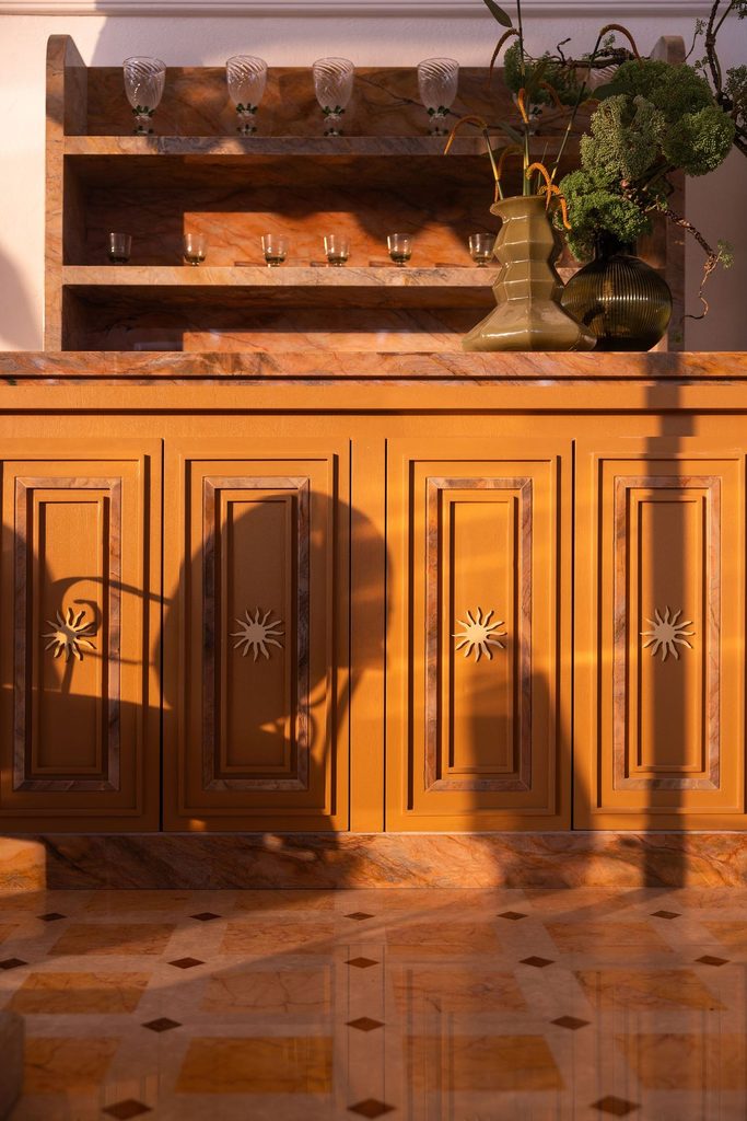
That thinking can be seen in the precision of the marble flooring and in the bespoke millwork, but particularly in the service counter, where marble and natural wood meet through carefully resolved curves and junctions. Custom display units provide quiet backgrounds for handmade pieces and curated objects rather than functioning as decorative statements in themselves.
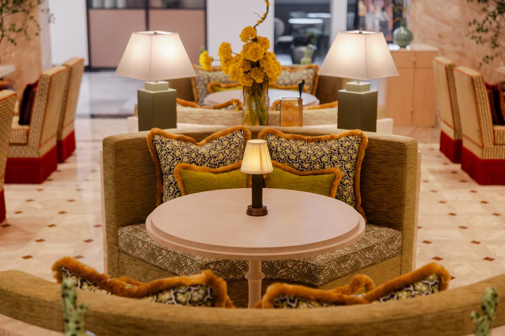
Curves form another, less immediately obvious, thread. Rounded and cylindrical geometries move between architectural details, furniture and millwork, creating continuity across the restaurant. They also emerged as a response to something NAQSH could not change.
Although Solenn occupies a newly constructed building, its architectural shell was already fixed when the designers arrived. Its irregular geometry presented a significant planning challenge, while existing rounded arched windows with Georgian-bar detailing introduced a strong architectural language of their own.
Rather than fight them, the studio responded with contemporary curved forms that sit alongside the existing architecture. More unexpectedly, the awkward geometry helped determine the position of the double-sided service counter at the centre of the plan.
“What initially appeared to be a planning constraint became the heart of the design,” Manafi says, “creating a natural focal point and a sense of connection throughout the space.”
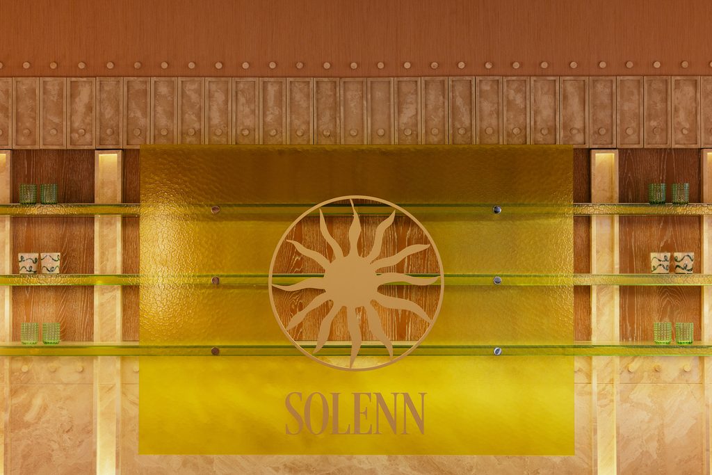
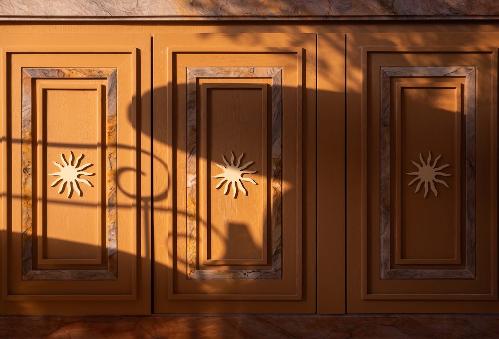
Behind it, yellow textured glass provides one of the interior’s few deliberately expressive architectural moments. The colour references the sun within Solenn’s visual identity, while a precisely executed cut-out accommodates the sun element of the logo. Its installation proved technically demanding, but the result gives the counter colour and depth without turning it into a conventional statement feature. From different parts of the restaurant, it operates simultaneously as an orientation point, service element and visual anchor.
This resistance to the “statement feature” is important. At a moment when hospitality interiors can easily be conceived through the lens of the image they will generate, Solenn deliberately avoids designing a single corner for social media.
“There is a difference between designing a space that looks beautiful in an image and creating one that feels beautiful to experience,” Manafi says. “Photography can capture the colours, materials and architectural details, but it cannot fully communicate the atmosphere, comfort or the way a space makes people feel.”
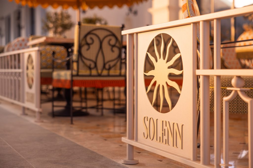
There is, she points out, “no single statement piece or particular corner designed to become the restaurant’s defining ‘Instagrammable moment’.” Instead, lighting, colour, tactile materials, comfortable furniture and views across the equestrian grounds are intended to register collectively.
It is an approach that feels particularly relevant to contemporary hospitality. Solenn has a clear identity, its tomato-derived palette, yellow glass, curved forms and carefully worked stone give it that, but none is intended to become an isolated visual signature. Design operates in support of what happens inside the restaurant: eating, talking and staying.
“Ultimately, we wanted to create a restaurant whose character becomes more apparent the longer you spend in it,” Manafi concludes. “A space that people remember not necessarily for how it looked, but for how it made them feel.”